
![P4190006[1]](/images/slider/P4190006[1].jpg)
![P6230068[1]](/images/slider/P6230068[1].jpg)
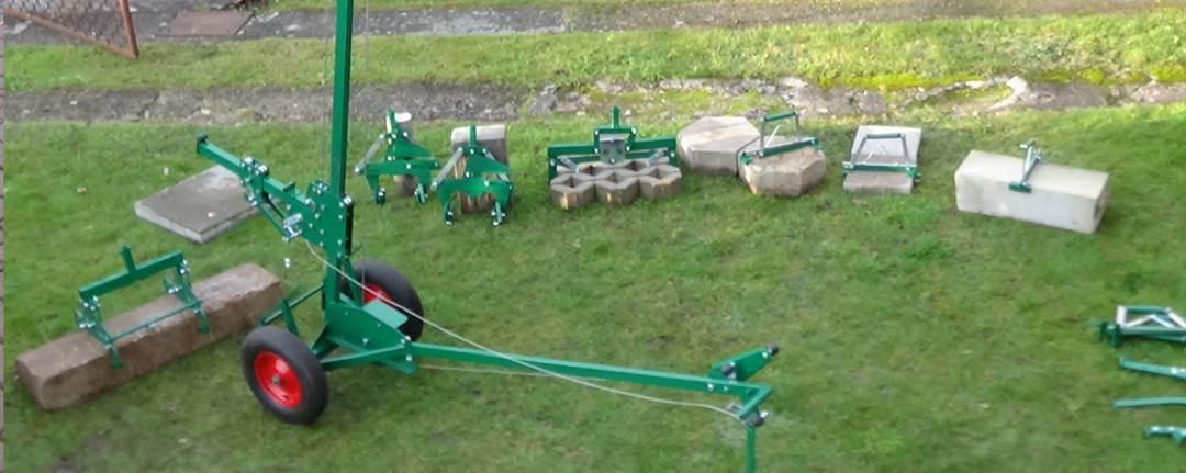
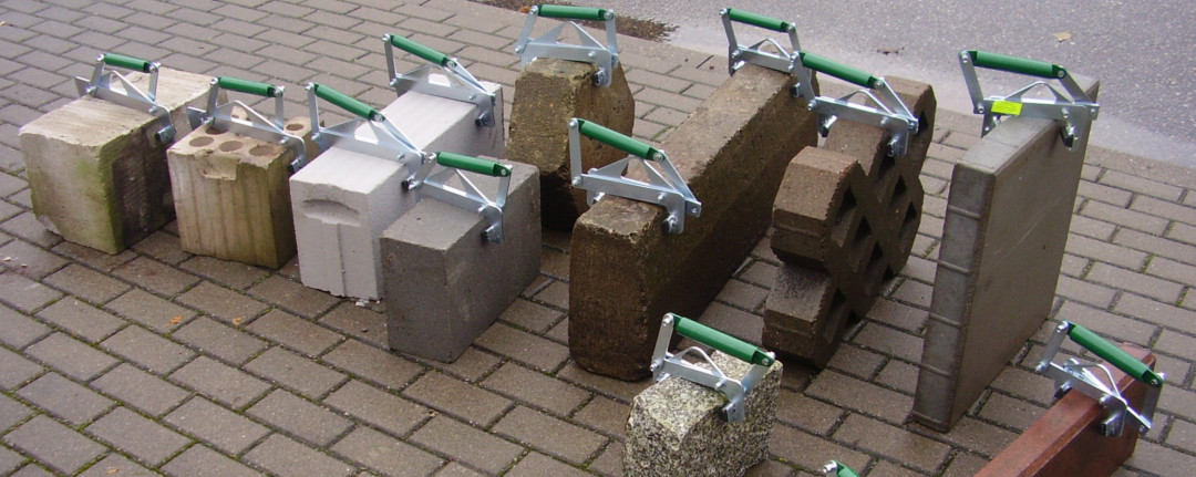
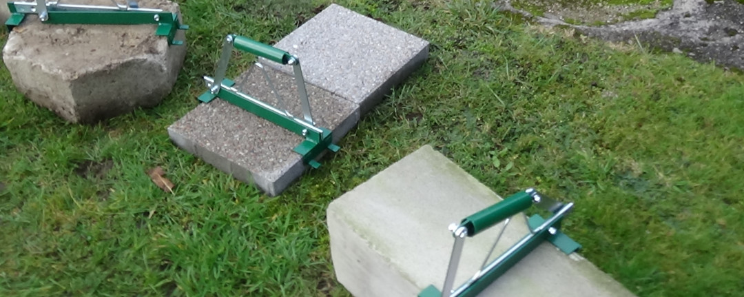
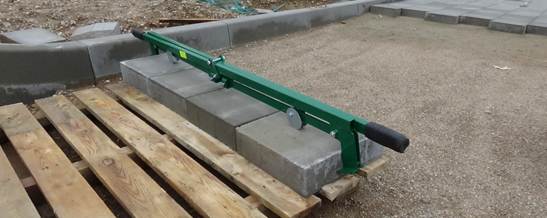
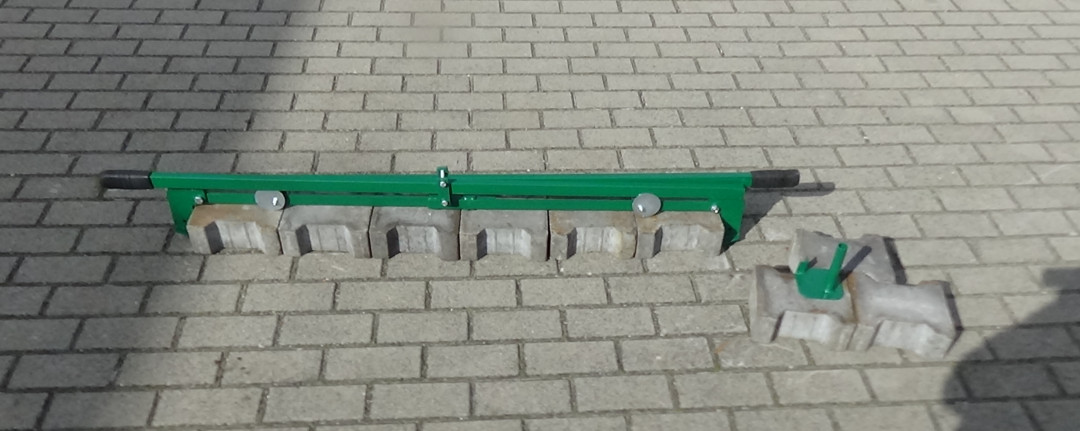
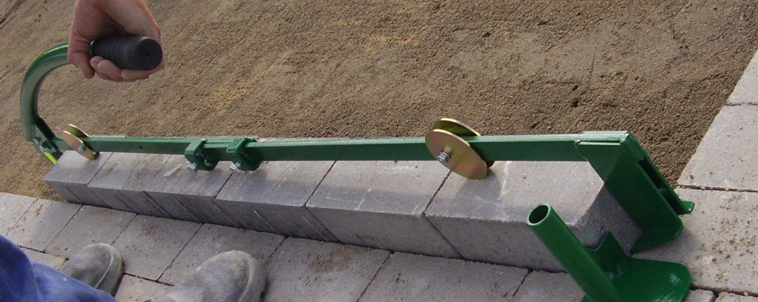
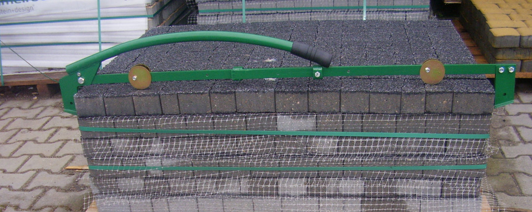
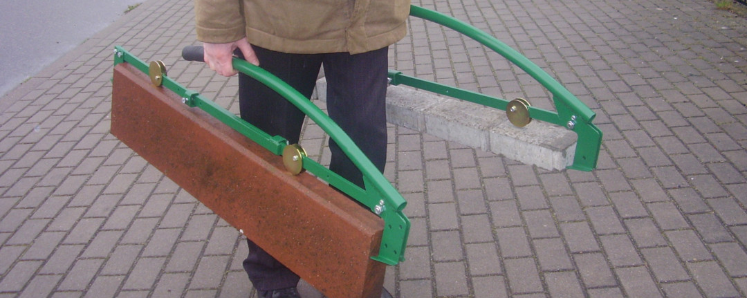
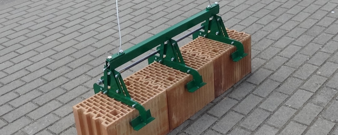
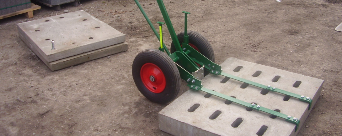
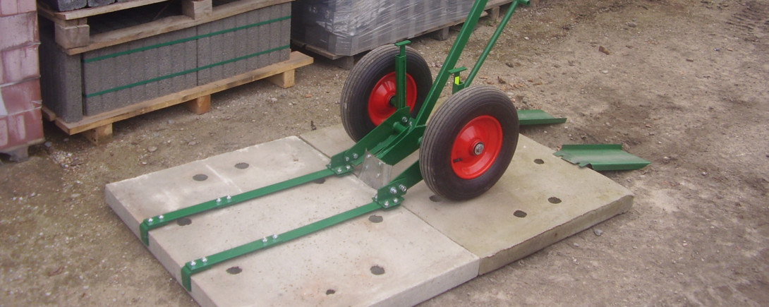
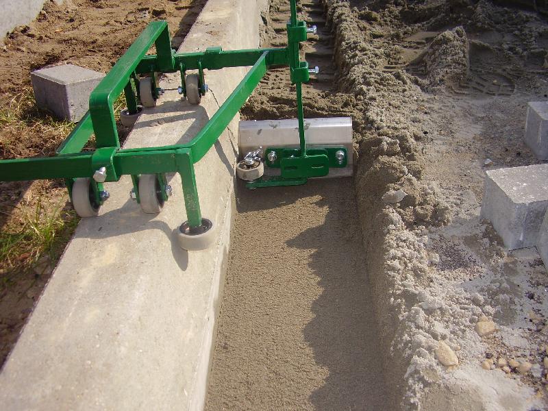
Nasz produkty:
Produkcja naszych oferowanych elementów oparta jest na doświadczeniu i wieloletnim rozwoju.
- wysoka jakość potwierdzona zamówieniami,
- gwarancja dostępnosci
- niskie ceny produktów
- wsparcie dla klienta
Oferta:
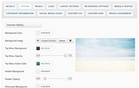 As well as the many color choosers which allow you to customize each element of your template, this template also allows you to edit the background image visible in the header, slideshow and bottom module positions from within your templates parameters.
Using the corresponding field under the Styling tab of your templates parameters hit the 'Select' button to access your Media Manager. From here you can upload the header background image of your choice directly from your computer. You can also remove this image and replace it with the color of your choice
It is also worth remembering that Joomla allows you to create multiple template styles which can then be applied to the menu items of your choice. This gives you full control of setting different backgrounds on different pages throughout your site.
It has become common knowledge that every day the number of mobile devices used to view your site grows. Responsive design gives your site the power to provide an optimal viewing experience across a wide range of devices from a mobile phone to a desktop computer monitor.
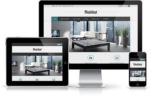 So how does it work? With the use of media queries different CSS style rules are loaded depending on characteristics of the device your site is been viewed with, most commonly the width of your browser. With each set of rules your site will be styled to best display on the matching device.
At Joomla51 we have embraced this new trend in website design and implemented responsive design to all our new releases, resolving any problems assoiciated with how your site will display on smaller resolution screens. To view how your template will respond to each screen resolution simply resize your browser window, as you reduce the width of your browser the template will react accordingly, altering its layout and style to best accomodate the site content within the available viewing area.
Alongside its responsive design, the template features a number of options within its parameters allowing you control over what content is displayed on smaller mobile devices. From your Joomla administration navigate to Extensions -> Template Manager -> J51_[YourTemplate] -> Responsive Options, here you will find a number of toggle switches to turn on/off each set of modules. If there is a situation where you would sooner your site to display the same on all devices then not to worry as we have added an option here to do that to (“,).
Heading1 (h1) looks like this
Lorem ipsum dolor sit amet, consectetuer adipiscing elit, sed diam nonummy nibh euismod tincidunt ut laoreet dolore magna aliquam erat volutpat. Ut wisi enim ad minim veniam, quis nostrud exerci tation ullamcorper suscipit lobortis nisl ut aliquip ex.
Heading2 (h2) looks like this
Lorem ipsum dolor sit amet, consectetuer adipiscing elit, sed diam nonummy nibh euismod tincidunt ut laoreet dolore magna aliquam erat volutpat. Ut wisi enim ad minim veniam, quis nostrud exerci tation ullamcorper suscipit lobortis nisl ut aliquip ex.
Heading3 (h3) looks like this
Lorem ipsum dolor sit amet, consectetuer adipiscing elit, sed diam nonummy nibh euismod tincidunt ut laoreet dolore magna aliquam erat volutpat. Ut wisi enim ad minim veniam, quis nostrud exerci tation ullamcorper suscipit lobortis nisl ut aliquip ex.
Heading4 (h4) looks like this
Lorem ipsum dolor sit amet, consectetuer adipiscing elit, sed diam nonummy nibh euismod tincidunt ut laoreet dolore magna aliquam erat volutpat. Ut wisi enim ad minim veniam, quis nostrud exerci tation ullamcorper suscipit lobortis nisl ut aliquip ex.
Heading5 (h5) looks like this
Lorem ipsum dolor sit amet, consectetuer adipiscing elit, sed diam nonummy nibh euismod tincidunt ut laoreet dolore magna aliquam erat volutpat. Ut wisi enim ad minim veniam, quis nostrud exerci tation ullamcorper suscipit lobortis nisl ut aliquip ex.
<pre> or <div class="code">
To display note use: <p class="note">Sample of your note !</p>
To display pin note use :<p class="pin">Sample of your pin note !</p>
To display clip note use:<p class="clip">Sample of your clip note</p>
To display download note use:<p class="down">Sample of your download note</p>
Ordered List
- Lorem ipsum dolor sit amet consectetur
- Lorem ipsum dolor sit amet consectetur
- Lorem ipsum dolor sit amet consectetur
Un-Ordered List
- Lorem ipsum dolor sit amet consectetur
- Lorem ipsum dolor sit amet consectetur
- Lorem ipsum dolor sit amet consectetur
Un-Ordered List witch class="tick"
<ul class="tick"><li>Your list item goes here!</li></ul>
- Lorem ipsum dolor sit amet consectetur
- Lorem ipsum dolor sit amet consectetur
- Lorem ipsum dolor sit amet consectetur
Un-Ordered List witch class="star"
<ul class="star"><li>Your list item goes here!</li></ul>
- Lorem ipsum dolor sit amet consectetur
- Lorem ipsum dolor sit amet consectetur
- Lorem ipsum dolor sit amet consectetur
Un-Ordered List witch class="plus"
<ul class="plus"><li>Your list item goes here!</li></ul>
- Lorem ipsum dolor sit amet consectetur
- Lorem ipsum dolor sit amet consectetur
- Lorem ipsum dolor sit amet consectetur
Blockquote
<blockquote><p>Your list item goes here!</p></blockquote>
Lorem ipsum dolor sit amet, consectetuer adipiscing elit, sed diam nonummy nibh euismod tincidunt ut laoreet dolore magna aliquam erat volutpat.
Emphasis Tags
<em class="highlight black">your text</em>
An emphasis tag that allows you to highlight some text in black.
<em class="highlight blue">your text</em>
An emphasis tag that allows you to highlight some text in blue.
<em class="highlight red">your text</em>
An emphasis tag that allows you to highlight some text in red.
<em class="highlight green">your text</em>
An emphasis tag that allows you to highlight some text in green.
<em class="highlight yellow">your text</em>
An emphasis tag that allows you to highlight some text in yellow.
Image Frames
<img src="/images/yourimage.jpg" class="frame-1"/>

<img src="/images/yourimage.jpg" class="frame-2"/>
2 Column Layout
<div class="col-2"><div>First column of your content...</div></div>


<div class="col-2"><div>Second column of your content...</div></div>


<div class="clear"></div>
3 Column Layout
<div class="col-3"><div>First column of your content...</div></div>


<div class="col-3"><div>Second column of your content...</div></div>


<div class="col-3"><div>Third column of your content...</div></div>


<div class="clear"></div>
4 Column Layout
<div class="col-4"><div>First column of your content...</div></div>


<div class="col-4"><div>Second column of your content...</div></div>


<div class="col-4"><div>Third column of your content...</div></div>


<div class="col-4"><div>Fourth column of your content...</div></div>


<div class="clear"></div>
5 Column Layout
<div class="col-5"><div>First column of your content...</div></div>


<div class="col-5"><div>Second column of your content...</div></div>


<div class="col-5"><div>Third column of your content...</div></div>


<div class="col-5"><div>Fourth column of your content...</div></div>


<div class="col-5"><div>Fifth column of your content...</div></div>


<div class="clear"></div>
This template comes with different module styles and icons. For each module you can pick a style and combine it with an icon creating your own unique look.
You can set your module style via the Module Class Suffix field within your modules parameters. Navigate to Extensions -> Module Manager -> [YourModule] -> Advanced Options -> Module Class Suffix.
Easily adjust your templates widths and column layout via the Layout Options section of your templates parameters which can be accessed by navigating to Extensions -> Template Manager -> J51_YourTemplate.
Set you template width using the appropriate field in pixels. By default this is set to 960 which sets your template width to 960px.
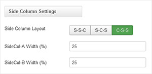
From your 'Side Column Layout' buttons simply set the layout of your side columns in relation to your site content with options for both your side columns to appear on either the left or the right or on either side of your content/component area.
For a single column layout simply disable all modules in the sidecol-a and sidecol-b module positions.
Your side column widths can also be customised via this section. Place the desired width of your side column by percentage in the Side Column Width field. Your content area will automatically contract/expand to fill the remaining available area.
